Card
DaisyUICards are used to group and display content in a way that is easily readable.
Basic Card
Basic Card
This is a simple card with just a title and some text content.
Styled Card
Styled Card
This card uses primary color with border style.
With Image
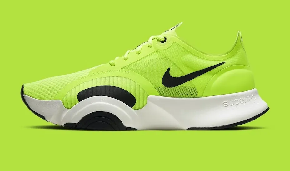
Card with Image
Cards can include a figure element for images.
Side Layout

Side Layout
The side layout places the image next to the content.
Sizes
Extra Small
Extra small card.
Small
Small card.
Medium
Medium card (default).
Large
Large card.
Code Example
use rsxui::components::{ Card, CardBody, CardFigure, CardTitle, CardActions, CardStyle, Color};use rsx_macros::rsx;let html = rsx! { <Card color=Color::Primary style=CardStyle::Border class="bg-base-100 w-96 shadow-sm"> <CardFigure> <img src="photo.jpg" /> </CardFigure> <CardBody> <CardTitle>"Title"</CardTitle> <p>"Content"</p> <CardActions> <button class="btn">Action</button> </CardActions> </CardBody> </Card>};Created by Isak Rickyanto@2026